The decision, with conditions
- Choose this route when
- Choose the richer scheme when one major surface leads and neighboring upholstery, wall areas or furniture provide useful pauses, with the arrangement remaining comfortable through a complete evening.
- Use the alternative when
- Quiet a broad competing textile or adjust flattering but flat illumination before repainting the favored wall, especially when circulation and furniture density also need attention.
- Stop or change the plan when
- Stop adding patterns and reflective accessories when they obscure the room's main forms or useful surfaces; a coordinated color list does not establish a coherent occupied room.
Compare the practical options
| Room symptom | First diagnosis | Adjustment to try |
|---|---|---|
| Several patterns demand equal attention | Compare their scale and contrast | Quiet one broad textile or wall field |
| Dark room feels difficult to use | Check reading light, faces and glare | Place useful light rather than only increasing central brightness |
| Every table feels crowded | Separate useful surfaces from display | Keep fewer substantial objects with space around them |
| Palette feels heavy despite good light | Review furniture quantity and routes | Remove a duplicated or unused piece before repainting |
A rich room needs somewhere for the eye to pause
Choose which strong element deserves attention before adding another rich layer. A patterned rug, deep wall and expressive upholstery can coexist, but they need not compete equally from every seat. Compare the room with one element temporarily quieted to find where visual relief is missing, rather than assuming the whole palette must become pale.
This approach is useful when you love a dramatic palette but find that the room looks better in photographs than it feels during an ordinary evening. The problem may be glare, competing patterns, furniture density, or insufficient task lighting rather than the color itself. Diagnose those factors before repainting everything pale. A dark room can be comfortable and legible when its contrasts and lighting support the activities taking place. The design should allow both atmosphere and practical use.
Choose a principal source of richness
Identify the broad field you most want to retain, then temporarily quiet one competing neighbor with a suitable plain sample. Compare the doorway and seated views before changing anything else. If the wall now reads clearly, the issue was competition rather than excessive depth of color. If furniture still blocks useful views or movement, edit that layout separately. Record the actual evening setting used for the comparison so a dramatic lamp arrangement does not disguise the room's ordinary condition. Keep strong color where it has a deliberate role.
Look at the scale of pattern as well as its color. Small repeated motifs can form a busy field, while a larger pattern may read more calmly from across the room. Two patterns that share a hue may still compete if their scale and contrast are similar. Try them together at a useful size before committing to upholstery or wallpaper. A small sample can hide the intensity of repetition, especially when the material will cover a broad wall or a large seating piece.
Use plain surfaces as intentional elements
A plain curtain or sofa cover can be an active part of the composition rather than an unfinished area. It gives the patterned rug or decorative wall a place to register. Choose the plain material for its tone, texture, and behavior in the room's light. A glossy fabric can be visually active despite having no motif, while a matte woven surface may provide more relief. The relevant question is how the complete surface reads, not whether the product is labeled plain.
Avoid filling every empty tabletop with an object intended to complete the style. Clear working surfaces help the room remain usable and provide a different kind of visual pause. A side table needed for a drink should not be occupied permanently by a large decorative arrangement. Keep the objects you genuinely enjoy, but give them enough separation that their forms can be seen. Richness is often more convincing when a few substantial pieces are allowed to hold attention rather than being surrounded by smaller competitors.
To connect varied pieces without adding another strong pattern, see Making an eclectic living room coherent through one repeated color.
Make lighting describe the room
A dark palette can absorb or redirect light differently from a pale one, so plan the tasks explicitly. Reading, conversation, moving through the room, and displaying an artwork may need different light positions. A single powerful ceiling fitting can create glare while leaving useful surfaces poorly served. Try existing lamps in different positions before buying more. Observe where light reaches the page, where it reflects in framed glass, and whether the faces of people sitting together remain comfortably visible.
If dimming or new electrical work is proposed, check product compatibility and use an appropriate installer. Decorative bulbs and dramatic fittings are not a complete lighting plan. Judge the room from the seated positions, including the place closest to a reflective mirror or a glossy picture frame. A fitting may be attractive from the doorway yet expose an uncomfortable bright source from the sofa. The mood should remain enjoyable through a real evening, not only during the brief moment when all lights are arranged for a photograph.
Keep architectural detail readable
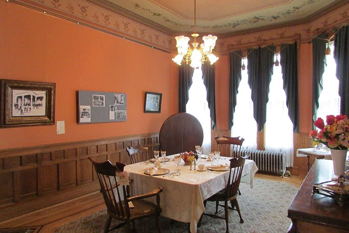
Where existing moldings, cornices, or fireplaces are present, decide which details should remain visible and how the new palette relates to them. Painting everything one color can create continuity, but it may also flatten detail you value. Contrasting every trim can create a different kind of busyness. Test a small, appropriately prepared sample area or a visual mockup before committing, and consider the condition and significance of the existing surfaces. Original or protected features may require specialist conservation or approval advice before alteration.
Do not add decorative framing merely to make a newer room appear older if the proportions do not support it. A contemporary room can borrow the richness of color and material without pretending to have a different history. Simple framing, substantial curtains, or an expressive artwork may be enough. The modern part of modern Victorian design can be a willingness to let new elements remain clearly new, with cleaner lines that help the more decorative pieces become legible.
For a more detailed approach to original bedroom architecture, read A modern Victorian bedroom that leaves original details legible.
Edit furniture before editing the color
Walk the routes through the room with the furniture occupied. A dense collection of tables, stools, and cabinets can make a richly colored room feel crowded even when the palette is well judged. Remove pieces that duplicate a function or obstruct movement. A chair that is never used may be taking the visual space needed by the sofa and main cabinet. Color is often blamed for a room's heaviness when the more direct problem is the amount and placement of furniture.
Keep the seating group oriented around its actual use. If conversation matters, make the seats relate to one another; if reading is important, provide a comfortable light and a reachable surface. Do not arrange a decorative chair in an unusable corner simply because its silhouette balances a photograph. It can still contribute to the room if its location supports a real activity. This practical editing makes it possible to retain richer materials without requiring the room to become sparse or impersonal.
Test the balance with one complete evening
Choose one change that creates relief: remove a competing pattern, clear a surface, simplify a curtain, or reduce an unnecessary furniture piece. Use the room through an evening with the normal lights and activities. Ask whether the main rich element is easier to appreciate and whether practical tasks have improved. If so, the solution may be complete. Adding another decorative layer simply because the room now has space can undo the useful balance.
The final room should offer a sequence of emphasis and rest. A deep wall may frame an artwork, a patterned rug may sit beneath quieter upholstery, and a simple table may keep the seating area usable. None of those decisions makes the room less expressive. They allow its strongest qualities to be experienced without constant competition. A richly colored living room becomes comfortable when its atmosphere has structure and its visual pauses are treated as part of the design rather than as gaps waiting to be filled.
Check, record, then decide.
A proposed worksheet for your own observations. Use consistent units for dimensions and keep the conditions with each record.
Competing broad fields
Where to check From the main entrance and sofa looking across walls, upholstery and the largest patterned textile.
- Record
- Identify the intended leading surface and record pattern scale, contrast and competing glossy areas.
- Read the result
- Several equally strong fields can make the room difficult to read despite a coordinated palette.
- If it does not work
- Quiet one large neighboring surface before changing the entire wall color.
Useful evening illumination
Where to check At the actual reading seat and conversation positions under the lighting normally used.
- Record
- Note page visibility, faces obscured by contrast and reflected or exposed bright sources.
- Read the result
- A deep palette may be blamed for a light-placement problem that additional paint cannot solve.
- If it does not work
- Trial a better lamp position or suitable task source before abandoning the rich color.
Furniture density and clear surfaces
Where to check Along occupied routes and at the tables used for drinks, books and controls.
- Record
- List duplicated furniture functions and objects that must move before a surface can be used.
- Read the result
- Visual weight may come from unnecessary pieces rather than from the palette alone.
- If it does not work
- Remove one unused piece and reserve useful tabletop area.
A practical trial
- Compare sufficiently large material samples together rather than approving several patterns independently.
- Create one deliberate visual pause and use the room through a complete evening without adding compensating accessories.
- Review existing decorative detail before deciding whether contrast or one continuous color makes its hierarchy clearer.
Compare the same scope
- Leading wall, upholstery or pattern field
- Amount of plain supporting surface
- Occupied lighting conditions
- Furniture retained and removed
Cost drivers to discuss: Large textile or upholstery replacement; Wall preparation and finish scope; Lighting position and control changes.
Choose another route when: A richer decorative layer is not suitable when the room already lacks clear circulation or useful light for its principal activities.
The download is a blank record template. Your completed notes remain wherever you choose to keep them; this page has no measurement-submission service.
Sources for this guide
Each reference’s supported point and limits appear beside the relevant passage above. Product documentation applies to the named product, rather than every similar item or the photographed room.
Source text checked November 4, 2026. Specifications can change; confirm the current instructions for the exact item before ordering.
Your questions, considered.
How can I keep dark walls without making the room busy?
Let one strong material or pattern lead, with quieter neighboring surfaces and clear working tables. Check furniture density and light from occupied seats.
Why do coordinated patterns still compete?
Shared color does not guarantee a calm relationship. Similar scale and contrast can make several motifs equally demanding; compare large samples together.
Should every molding contrast with a deep wall color?
No. Outlining each detail may create another busy network. Test how the treatment affects the hierarchy and seek suitable advice before altering significant fabric.
About this guide: written with AI assistance for TIANLICHUJU. These are general design ideas, not a measured survey or a completed client project. Any domestic vignette is fictional. Confirm product specifications, site dimensions and local requirements before construction; use qualified professionals for regulated work. Read our editorial approach or suggest a correction.